Vodafone Idea PreTUPS VMS
Role: UI/UX Designer
Tool: Figma
Telecom operators process millions of digital transactions daily, including recharges, top-ups, and voucher distributions all through enterprise platforms like PreTUPS VMS. At Vodafone Idea, the existing interface was functional but visually dense, with complex hierarchies that made everyday operations slow and cognitively demanding.
How might we redesign a high-volume telecom management platform to simplify workflows, reduce operator errors, and create a clear, efficient experience without compromising system depth?


Project background and Personal Journey
PreTUPS VMS (Voucher Management System) is the operational backbone of Vodafone Idea’s prepaid business, a platform that manages millions of recharge and voucher transactions every single day. When I joined the UI/UX team, the system was known for its reliability but also its complexity. It had evolved over years of technical updates without a unified design approach, resulting in a product that was powerful yet difficult to navigate.
Most users weren’t struggling with what the system could do they were struggling with how to do it efficiently. Critical workflows like voucher creation, distribution, and reporting involved repetitive steps, dense forms, and fragmented screens. Operators often relied on tribal knowledge rather than interface cues to complete tasks correctly. That friction inspired me to focus on simplifying the interface, visualizing data more meaningfully, and optimizing repetitive flows for speed and clarity.
What made this project meaningful to me was its real-world impact every design improvement translated directly into time saved, fewer operational errors, and smoother coordination across thousands of users in Vodafone’s nationwide network. My goal was to humanize the complexity of telecom operations through design turning a functional but intimidating tool into an interface that felt logical, responsive, and easy to use for everyone involved.
The Problem
The legacy PreTUPS VMS interface was designed for functionality first and user experience came later, if at all. Over the years, as new features were layered onto the platform, the system grew dense, inconsistent, and unintuitive. Operators often faced a steep learning curve just to perform daily actions like generating transaction reports, recharging accounts, or checking voucher inventories.
The dashboards were data-heavy and visually cluttered, with limited hierarchy or guidance. Key metrics were buried deep within menus, while redundant navigation steps slowed down task completion. Users frequently switched between multiple screens to cross-reference information, resulting in longer processing times and a higher risk of errors.
At scale, these inefficiencies had real operational consequences. Every additional second spent locating a report or validating a transaction multiplied across thousands of users handling millions of interactions per day. What the system lacked wasn’t capability it was clarity, consistency, and speed.
The challenge, then, was to restructure and modernize PreTUPS VMS into a more usable, data-driven experience that maintained enterprise robustness while dramatically improving user efficiency and comprehension.
Research: Competitive & SWOT Analyses
Airtel Mitra

Airtel Mitra, one of India’s most widely adopted telecom retailer and partner platforms, has long established itself as a trusted tool for recharge operations, customer onboarding, and SIM lifecycle management. The app serves as a central operational hub for millions of small retailers, distributors, and field agents who rely on it daily for transactions, commissions, and service support. Users value Airtel Mitra for its stability, extensive feature set, and strong integration with Airtel’s nationwide network infrastructure, which reinforces confidence in accuracy and uptime. However, while the platform covers a broad spectrum of telecom operations, it has also been critiqued for its dated UI patterns, dense workflows, and inconsistent performance across devices and regions. Compared to newer, more streamlined partner apps, Airtel Mitra’s strength lies in its massive ecosystem, service depth, and operational reliability — yet it continues to face challenges in modernizing its experience, reducing complexity, and keeping pace with evolving retailer expectations.
JioPOS Lite

JioPOS Lite, Reliance Jio’s streamlined partner and retailer application, has quickly gained traction as a modern, lightweight platform designed to simplify recharge operations and commission-based earnings for small retailers. Its appeal lies in Jio’s strong digital ecosystem and the app’s frictionless onboarding process, allowing users to begin transacting with minimal setup overhead. Retailers appreciate the app’s clarity, reliable wallet management, and integration with Jio’s broader service network, which reinforces trust and operational efficiency. Despite its accessible design and rapid adoption, JioPOS Lite has been critiqued for its limited advanced analytics, basic reporting features, and smaller suite of enterprise-level tools compared to full-fledged retailer platforms. While its strength lies in simplicity, accessibility, and Jio’s powerful brand presence, the app continues to face challenges in scaling its capabilities for high-volume distributors, offering deeper insights, and meeting the evolving expectations of a growing partner ecosystem.
User Interviews & User Surveys
To build on the survey insights, I conducted one-on-one interviews with PreTUPS users across three key roles: telecom operators, regional administrators, and system managers. The conversations focused on their daily tasks, time spent navigating between modules, and the common obstacles faced during high-traffic operations. Operators shared how the dense layout slowed them down during peak transaction hours, while administrators highlighted inconsistencies in reporting interfaces. Managers expressed frustration with redundant steps when approving or tracking transactions. These discussions provided deep contextual understanding, helping define the design priorities around simplified navigation, clearer hierarchy, and task-oriented dashboards to enhance user productivity and reduce cognitive load.
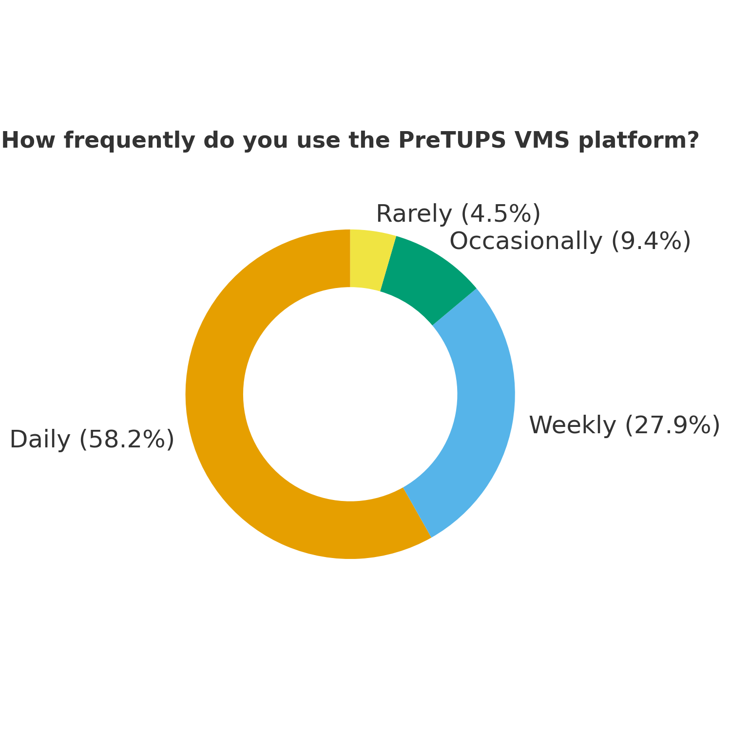


User Surveys Takeaway
The user survey provided clear insights into how frequently the PreTUPS VMS platform is used and where improvements were most needed. Over 58% of respondents reported daily use, reinforcing how integral the system is to their operational workflows. This daily reliance made even small usability issues like slow navigation and difficulty locating reports a significant source of frustration for many users.
Interestingly, when asked which features they valued most, the majority highlighted real-time transaction logs and voucher inventory tracking, underscoring the platform’s importance as a performance and monitoring tool rather than just a reporting system. However, users consistently called out a need for modernization: nearly one-third wanted a cleaner, modern interface, followed closely by requests for shorter workflows and improved dashboard visualizations.
These findings confirmed that while PreTUPS VMS performs strongly in terms of functionality and reliability, its user experience and interface design required a strategic overhaul. The insights guided the redesign direction focusing on visual clarity, workflow efficiency, and consistency across modules to align with the expectations of modern telecom professionals.
Card Sorts & Affinity Mapping
After gathering insights from interviews and surveys, I conducted card sorting and affinity mapping exercises with Vodafone Idea’s internal teams including system administrators, channel partners, and regional operations managers who interact with the PreTUPS VMS platform daily. The goal was to uncover recurring usability challenges, map user expectations, and align the redesigned dashboard with their workflow and mental models.
Through these collaborative sessions, participants grouped and prioritized issues around efficiency, visibility, and control. The affinity mapping exercise revealed key themes such as real-time awareness, task clarity, and error reduction, which became the foundation for the improved system architecture and dashboard hierarchy.
This process provided a clear understanding of what truly mattered to users from faster transaction monitoring to simplified navigation between reports. It also highlighted how different user groups approached the same tasks differently, helping to define role-based layouts that streamline everyday operations while maintaining consistency across modules.


Understanding Our Users: Personas, Flows, and Journeys
Before diving into the design phase, I engaged with different user groups within Vodafone Idea’s PreTUPS ecosystem including telecom operators, regional administrators, and distribution managers to understand their day-to-day responsibilities, technical comfort levels, and workflow pain points. Each group interacted with the system differently: operators focused on speed and accuracy, while managers cared about monitoring performance and ensuring network-wide reliability.
The research revealed that efficiency and clarity were the most valued outcomes across all roles. For instance, operators struggled with repetitive actions and long transaction paths, whereas administrators needed consolidated reports without navigating multiple tabs. By mapping out these patterns, I identified how information flowed through the system — from transaction initiation to final approval and where friction occurred.
Based on these findings, I developed detailed user personas and flow diagrams to visualize the end-to-end experience. Each persona represented a distinct user perspective:


Design Exploration, Ideation & Wireframes
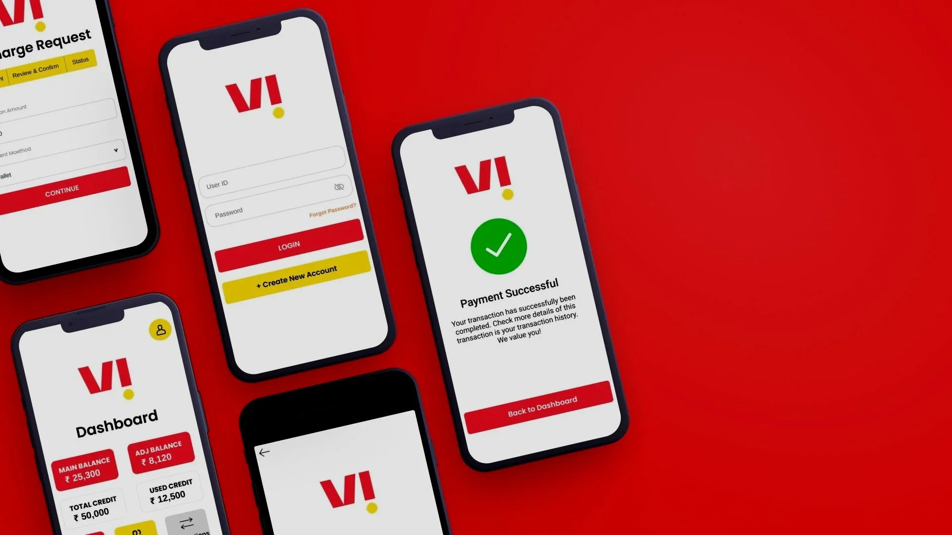
Before moving into visual design, I focused on exploring how the Pretups VMS mobile experience could be simplified for distributors, retailers, and field operators who complete fast, repetitive financial transactions throughout the day. The existing workflow was functional but cluttered, and required users to navigate multiple disconnected screens to perform basic tasks like initiating recharges, reviewing balances, or handling retailer requests.
To reimagine this experience, I began with a series of low-fidelity wireframes. These sketches helped me map out cleaner user journeys, reduce unnecessary steps, and emphasize the actions users perform most often. The login flow, dashboard, recharge request, and confirmation screens were intentionally kept minimal to test different layout patterns without visual distractions.
Using a mobile-first approach, I explored how important information like balances, transaction shortcuts, and retailer summaries could be surfaced at the very top of the dashboard. Each screen was structured to provide clarity at a glance, minimizing cognitive load and enabling fast decision-making even in busy environments. Early sketches also focused on improving hierarchy through clearer spacing, consistent card layouts, and large tap targets suitable for on-the-go use.
As the wireframes evolved, I ran small internal walkthroughs to validate whether the proposed flows matched real user behavior inside retail shops and distributor operations. This iterative sketch-and-feedback cycle helped refine the architecture of the app long before UI styling began. The final low-fi set provided a solid blueprint for designing a high-efficiency VMS interface—one that feels modern, predictable, and optimized for high-frequency transactions.


Usability Testing
To evaluate the redesigned PreTUPS VMS interface and measure its usability improvements, I developed interactive prototypes for both desktop and internal mobile dashboards. These were tested with five participants — including a regional manager, distributor lead, retailer, and two support engineers — each representing a critical user role in the PreTUPS ecosystem. The goal was to validate how efficiently users could perform their daily operations, identify transaction issues, and interpret dashboard insights without external assistance.
Scenario:
A distributor lead needs to process voucher requests, a retailer must complete a recharge during peak hours, and a system engineer must identify and resolve failed transactions — all while using the new interface designed for speed, clarity, and reduced error rates.
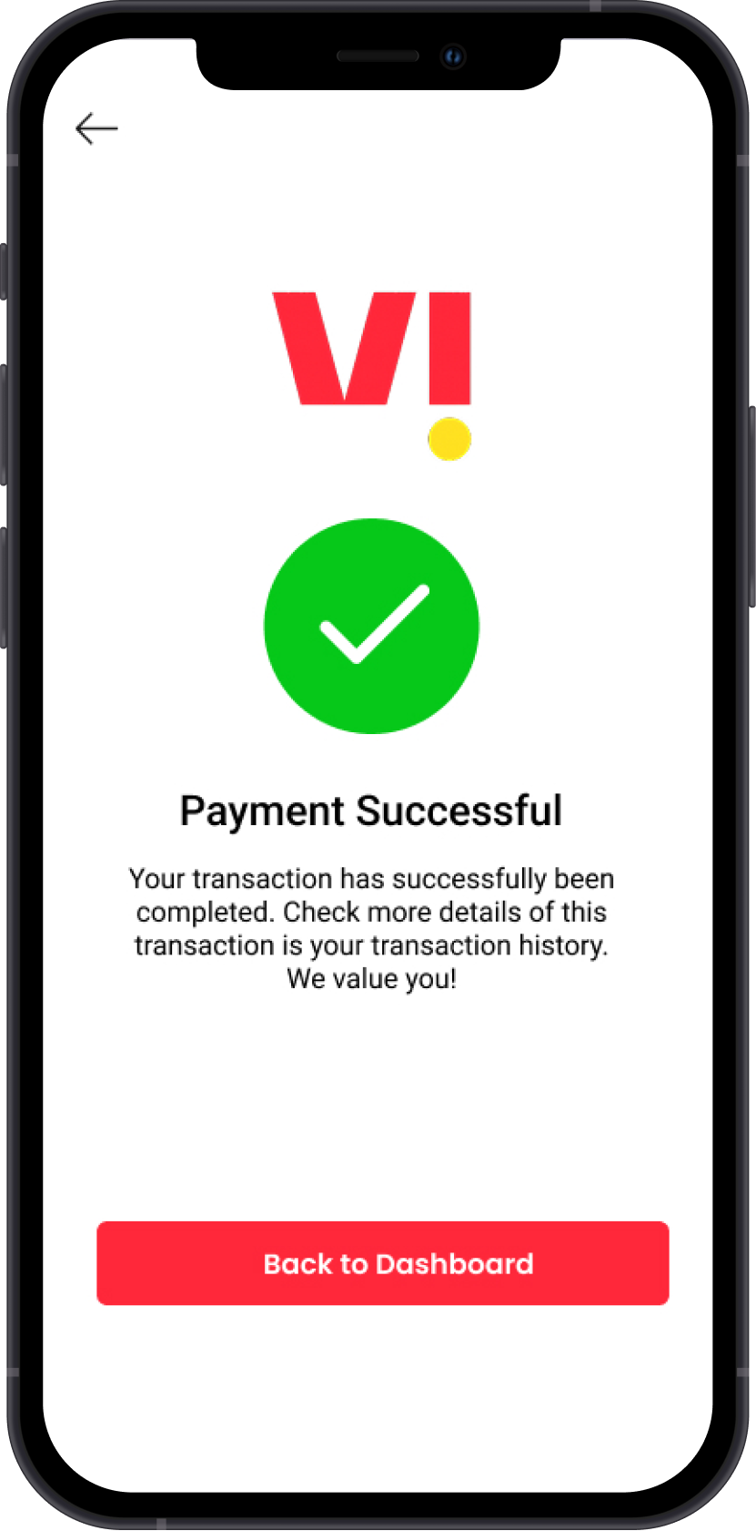
Task 1: Process a high-volume voucher top-up request and confirm completion using the redesigned transaction summary.
Task 2: Locate and review failure logs to trace the cause of a specific transaction error.
Task 3: Navigate to the dashboard to compare regional sales performance and export a report summary.
Participants were observed completing tasks under timed conditions, simulating real-world telecom workflows. The tests were conducted on both desktop and tablet views to assess layout adaptability, content visibility, and clarity of visual hierarchy.
The sessions revealed significant improvements in workflow speed and task completion accuracy. Users noted that the streamlined navigation and modular dashboard widgets helped them focus on key operations without distraction. However, feedback indicated a need for stronger iconography, clearer alert hierarchies, and persistent transaction history shortcuts for faster post-action review.
Insights from these sessions directly influenced the next design iteration — refining data visualization clarity, improving status color coding for alerts, and simplifying repetitive transaction flows. These refinements ensured that PreTUPS VMS delivers a faster, more reliable, and role-specific experience for every user, from front-line retailers to back-end engineers.
Usability Testing Results & Affinity Mapping
Following the usability testing sessions for the redesigned PreTUPS VMS, I synthesized user feedback using affinity mapping to identify recurring themes and prioritize enhancements. By categorizing responses across roles — from distributors and retailers to support engineers — the process helped isolate patterns that impacted operational efficiency, data visibility, and task flow clarity.
Using Nielsen’s Severity Rating Scale, the issues were ranked to determine which pain points required immediate attention. The most critical challenges were related to information overload on dashboard screens, inconsistent status indicators, and limited contextual help during error resolution. Lesser issues, such as visual spacing and icon legibility, were categorized as low severity but still addressed to improve overall experience consistency.
User Interface Design
The redesigned PreTUPS VMS interface focused on improving clarity and speed within a complex telecom workflow environment. The previous version was dense, text-heavy, and inconsistent across modules, often slowing down daily operations. My approach was to create a clean, modular interface that simplified information flow and reduced unnecessary steps. By introducing grid-based layouts, balanced white space, and consistent visual hierarchy, the design now allows users to process high-volume transactions, view reports, and monitor performance with ease.
A key part of the redesign was establishing a status-driven color system that communicates information at a glance. Green, amber, and red indicators clearly represent transaction success, pending actions, or failures requiring attention. These visual cues, combined with contextual icons and improved button placement, help users prioritize tasks without searching through multiple logs or reports. Typography and contrast were refined to improve legibility in data-dense dashboards, while responsive layouts ensure accessibility across desktop and tablet devices.
The final interface blends functionality with Vodafone Idea’s brand identity — confident reds, clean neutrals, and precise structure. Every element was designed to reduce friction and help users focus on what matters most: efficiency and accuracy. The result is a cohesive, insight-driven platform that transforms PreTUPS from a technical backend tool into a human-centered, decision-support system that empowers operators, managers, and retailers alike.
What I learned
Redesigning PreTUPS VMS taught me how essential it is to blend complex system logic with user empathy. Enterprise tools like this aren’t just about features; they’re about trust, speed, and efficiency under real-world pressure. I learned that simplifying doesn’t mean stripping down functionality; it means structuring information so that every user, whether a distributor or a retailer, can act confidently and quickly.
Through close collaboration with operators, engineers, and business managers, I realized that each user group experiences the same system differently. Designing with these perspectives in mind helped me embrace a role-based design mindset, where clarity, accessibility, and responsiveness define usability. This project deepened my understanding that successful enterprise design isn’t about visuals alone it’s about making complex processes feel simple, predictable, and empowering.