IDOT Website Modernization
Role: UI/UX Designer
Tools: Figma | AEM | SiteImprove
The Illinois Department of Transportation serves millions of visitors annually through its public web ecosystem, providing access to project updates, permits, safety programs, and travel information. While functional, the legacy site struggled with outdated design patterns, complex navigation, and a poor mobile browsing experience, making it harder for users to quickly find the critical information they needed.
How might we redesign a large-scale government website to be accessible, mobile-responsive, and user-friendly while maintaining accuracy, trust, and compliance for millions of Illinois residents?
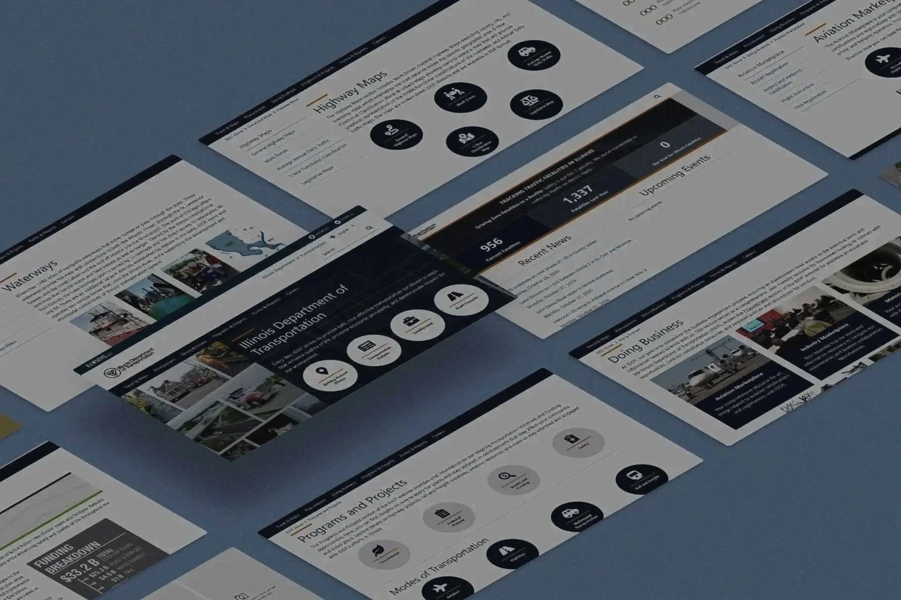
Before
Project background and Personal Journey
When I joined IDOT, the website had hundreds of static pages built over time by multiple content teams with inconsistent structure and design patterns. Citizens, contractors, and businesses often struggled to find critical information like project updates, permits, or safety resources.
As both a designer and developer, my motivation was clear: transform this complex, outdated web system into a streamlined, accessible, and intuitive experience one that respects user’s time and meets WCAG 2.1 AA standards.
Coming from a product and front-end background, this project gave me a chance to merge both sides of my skillset using research and data to guide design, and code to bring those designs to life inside Adobe Experience Manager (AEM).
The Problem
The challenge wasn’t just about appearance; it was structural. Over the years, IDOT’s website had expanded into hundreds of loosely connected pages with inconsistent layouts and deep navigation. Users often had to click through five or more layers to find basic information like road projects or permit forms, which made the experience slow and frustrating.
Mobile usability was another major gap. The site didn’t adapt well to smaller screens, leading to high bounce rates from people trying to access it on the go. At the same time, content authors struggled to maintain pages because of rigid, outdated templates that limited flexibility and led to duplicate or outdated information across sections.
Accessibility audits revealed multiple WCAG 2.1 violations, from low color contrast to missing alt text, making the site difficult for users with disabilities to navigate. Altogether, this fragmented structure eroded user trust and usability. The goal was to rebuild the ecosystem as a component-based, accessible, and efficient system, one that served citizens, contractors, and internal teams with equal ease.
Research: Competitive & SWOT Analyses
TxDOT

TxDOT, one of the largest and most established state transportation agencies in the U.S., has built a strong reputation for transparency and reliability in public infrastructure management. Its website serves as a central hub for citizens, contractors, and local agencies to access project updates, travel advisories, and bidding information. Users value the platform’s comprehensive data and clear organization of statewide initiatives, which reinforces trust and accountability. However, despite its functional foundation, the site has been critiqued for its dated interface, limited interactivity, and inconsistent design across regional pages. Compared to newer, digitally agile transportation portals, TxDOT’s strength lies in its scale, credibility, and depth of information yet it faces ongoing challenges in modernization, accessibility, and user engagement.

Caltrans
Caltrans, the California Department of Transportation, has long been recognized for its commitment to safety, innovation, and environmental sustainability in statewide infrastructure. Its digital presence reflects that mission, offering comprehensive access to project data, traffic updates, and public resources through an organized, transparent platform. Users appreciate the availability of live tools such as real-time traffic maps, construction alerts, and project dashboards, which help residents and commuters stay informed. However, while feature-rich, the website’s interface can feel crowded and dated, with dense text and occasional usability gaps on mobile devices. Compared to more recently modernized transportation portals, Caltrans stands out for its wealth of information and public trust but it still has room to evolve toward a cleaner, more intuitive, and accessible digital experience.
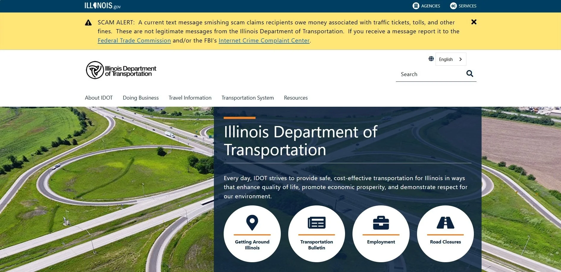
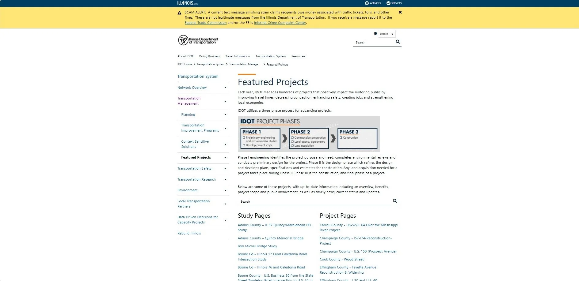
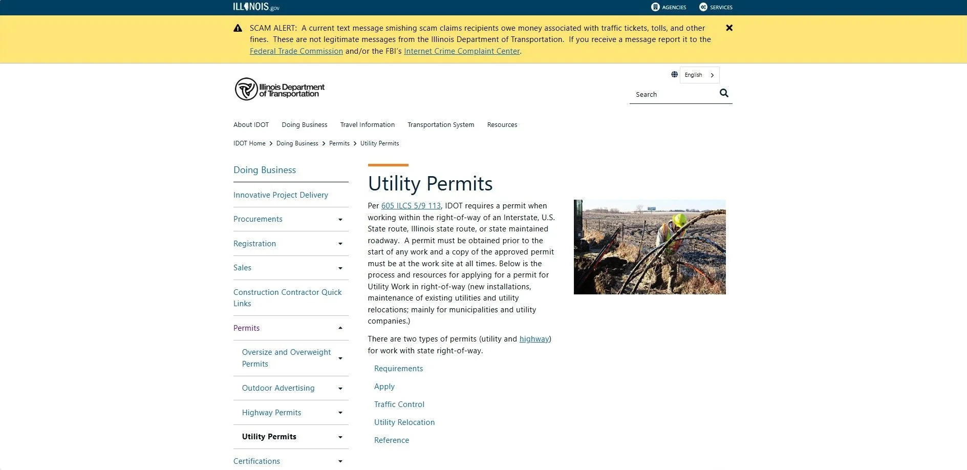
After


User Interviews & User Surveys
To understand how people interacted with the Illinois Department of Transportation website, I interviewed a mix of citizens, contractors, and internal staff who use it for different purposes. These conversations helped uncover where users struggled most and how they navigated the system in real-world scenarios.
The interviews revealed clear friction points. Citizens expressed difficulty finding project updates or permit forms due to buried links and deep navigation. Contractors mentioned the lack of centralized access to bidding documents and outdated layouts that made tasks slower. Internal content authors pointed out that updating pages required multiple manual steps, leading to inconsistencies and redundant content.
This first-hand feedback was invaluable; it showed that the site’s challenges weren’t only about design, but about trust, efficiency, and accessibility. The qualitative data from these sessions set the foundation for restructuring the information architecture and designing more intuitive user pathways.
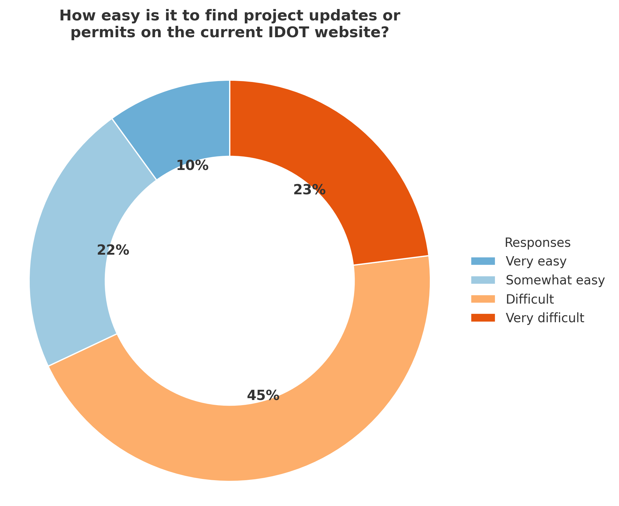
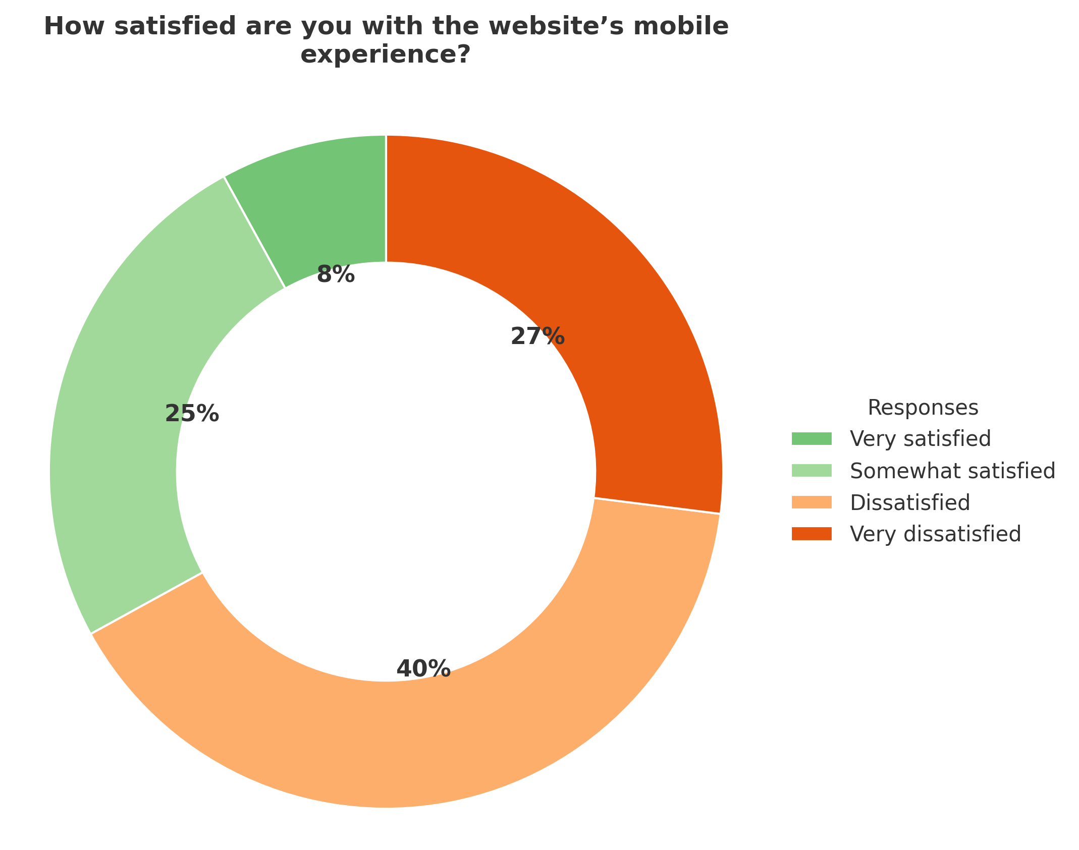
The user survey provided clear direction for the IDOT website redesign. Over two-thirds of respondents said it was difficult or very difficult to find project updates or permit information, confirming that navigation and content structure needed major simplification. Similarly, more than 65% of participants were dissatisfied with the mobile experience, citing slow load times and poor responsiveness when accessing updates on the go.
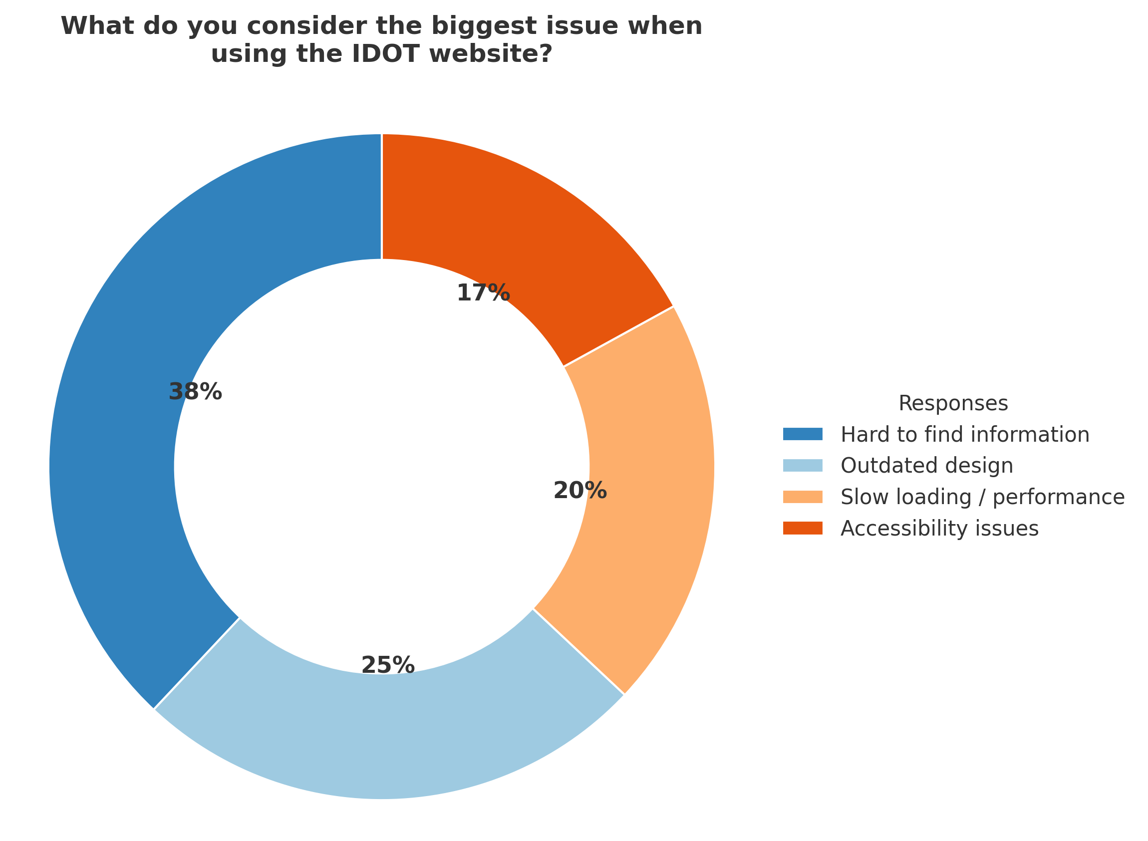
When asked about overall issues, most users pointed to inconsistent layouts, hard-to-find content, and a dated look that reduced trust in the site’s reliability. At the same time, 58% said accessibility compliance directly impacts their confidence in using government websites. Together, these insights reinforced the need to rebuild IDOT’s web ecosystem around clarity, accessibility, and responsive design ensuring that every visitor can find accurate, up-to-date information quickly and confidently.
User Survey Takeaways
Card Sorts & Affinity Mapping
Following the survey, I facilitated card sorting and affinity-mapping sessions with internal teams, contractors, and public users who frequently engage with IDOT’s digital services. These exercises helped uncover how different user groups prioritize information such as permits, road projects, or public notices and what they expect from a state-level platform.
Through this process, I grouped recurring patterns into three themes: Pain Points, Needs, and Behaviors. The mapping revealed that users value clarity, reliability, and accessibility above all. They want to find essential information quickly, trust that it’s current, and access it from any device without friction. These insights directly shaped the content structure, component library, and navigation strategy for the redesign.
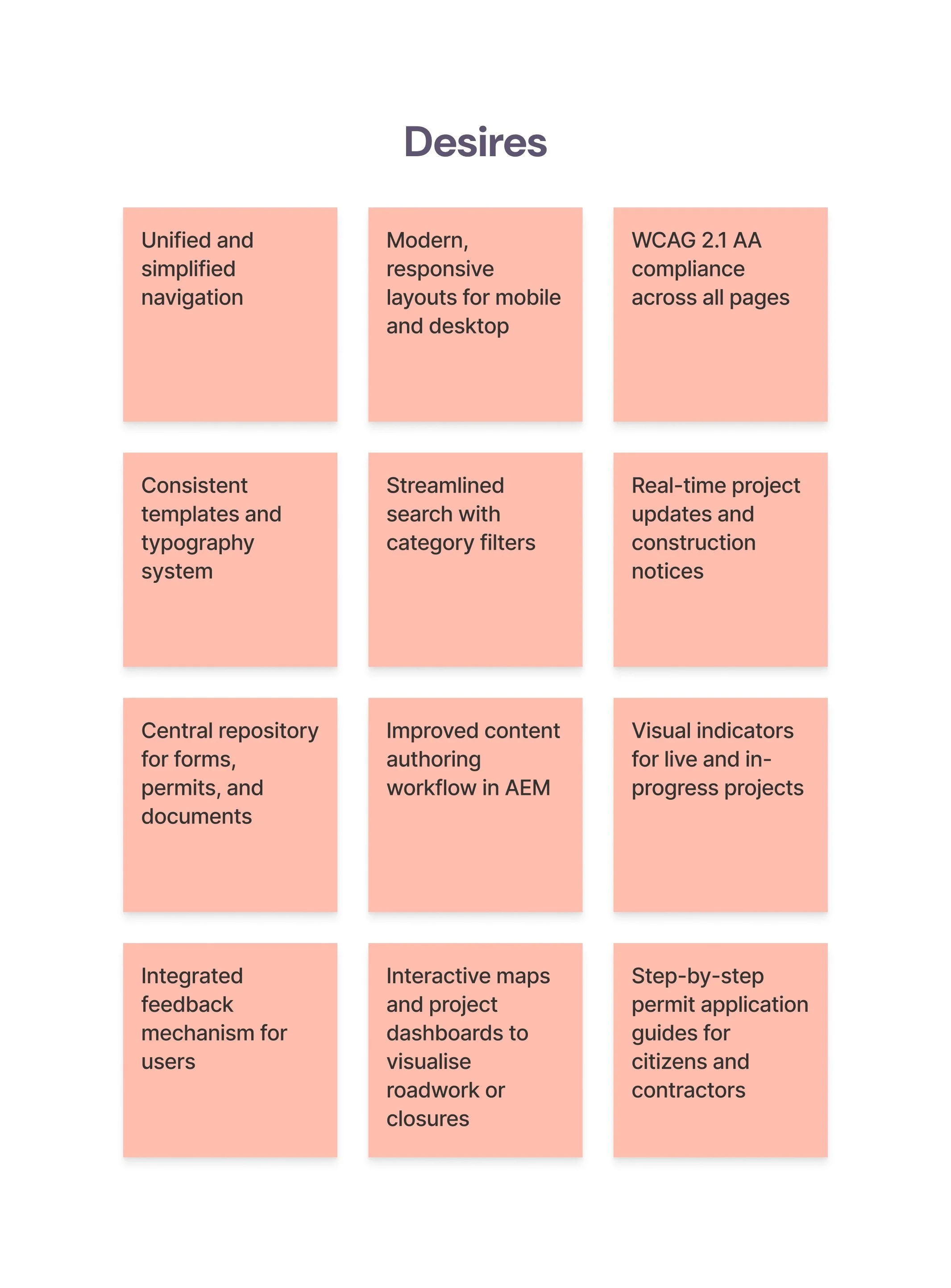


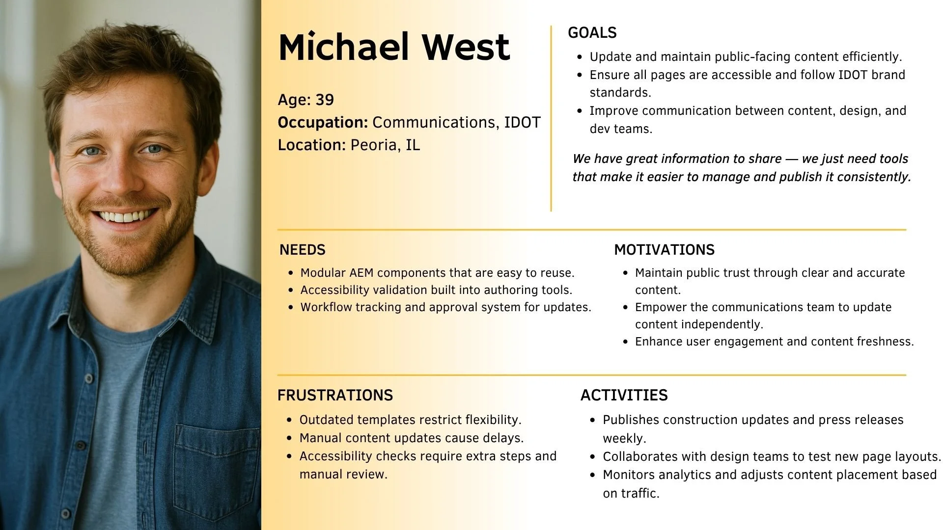
Understanding Our Users: Personas, Flows, and Journeys
Before beginning wireframes, I spoke with a diverse mix of IDOT website users including citizens, contractors, and internal teams to understand how they access transportation information and what challenges they face online. These conversations uncovered recurring frustrations around navigation, content consistency, and accessibility compliance.
By translating those insights into user personas, I defined clear user goals that shaped every design decision in the redesign process. Each persona highlights a unique use case from a commuter looking for traffic updates to an administrator maintaining hundreds of pages. Together, they represent the full ecosystem of people depending on IDOT’s digital presence daily.
Understanding Our Core Users


Design Exploration, Ideation & Wireframe Development
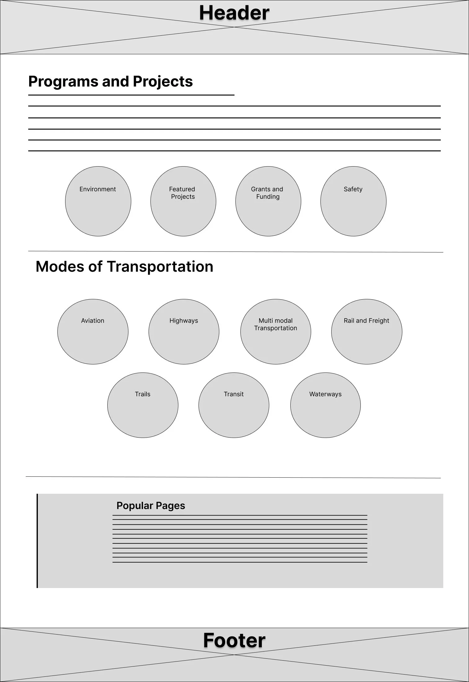
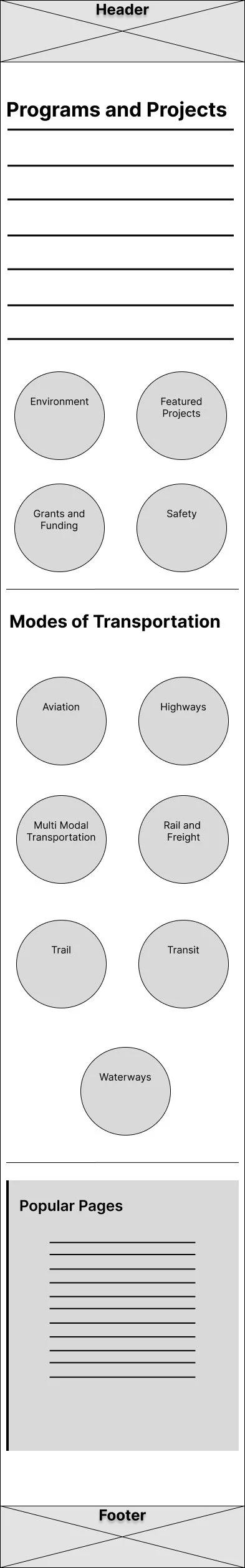
To establish a strong structure for the redesigned IDOT site, I began by drafting low-fidelity wireframes focused primarily on the desktop experience, while also designing responsive variations for mobile. Since IDOT serves citizens, contractors, and internal users who frequently use larger screens to access documents, project updates, and applications, the desktop layout became the foundation. These wireframes allowed me to reorganize dense information into clear content groupings, introduce consistent page templates, and build a logical hierarchy that reduces scrolling and improves scan-ability.
From there, I adapted each layout into mobile variations to ensure consistency and accessibility across devices. The intent was not visual polish, but clarity of flow — defining how users move between programs, initiatives, transportation modes, and resources with fewer clicks and less friction. This early exploration helped validate key UX decisions such as persistent navigation, simplified page headers, grouped service tiles, and modular content blocks that could scale across the 200+ pages of the IDOT ecosystem. By solving structure first, I created a blueprint that would support both high-volume desktop interactions and accessible on-the-go mobile use.
As part of this phase, I also explored multiple navigation patterns and content layouts before narrowing to the most intuitive structure. I compared mega-menus vs. simplified tiered navigation, evaluated icon based category groupings for accessibility clarity, and tested variations of “quick-access tiles” for high-demand actions like checking projects, permits, and travel updates. These experiments helped uncover friction points early such as confusing label hierarchies and overly deep navigation trees allowing me to refactor and streamline them long before visual design. By prioritizing clarity and consistency at this stage, the wireframes served as a “structural truth” for the system, ensuring the visual layer would rest on a strong, well-tested foundation rather than retrofitting UX decisions later.


Usability Testing
To validate the redesigned IDOT website’s functionality and ease of use, I developed interactive web and mobile prototypes and conducted usability testing sessions with five participants including citizens, contractors, and internal staff. The goal was to evaluate how effectively users could locate information, complete common tasks, and navigate the new structure without prior instruction.
Scenario:
A user needs to quickly find current road closure updates, locate the permits section, and access a project report all while ensuring the site is accessible and responsive on both desktop and mobile devices.
Task 1: Locate real-time road closure information and verify if the route between Springfield and Chicago has active construction alerts.
Task 2: Navigate to the “Permits and Licensing” section and begin the process of downloading a permit application.
Task 3: Access an ongoing project page and locate the downloadable project report or contact details of the project lead.
Participants completed the tests on both desktop and mobile to evaluate layout responsiveness, content hierarchy, and readability. The sessions revealed that while users appreciated the simplified navigation and improved search experience, several requested clearer visual cues for interactive elements and a more prominent placement for key citizen services.
Insights from these tests directly informed the next design iteration refining button contrast ratios, improving mobile menu depth, and optimizing accessibility labels ensuring the IDOT platform offers a faster, clearer, and more inclusive experience for all users.
Usability Testing Results & Affinity Mapping
Following the usability testing sessions for the IDOT web and mobile prototypes, I conducted an affinity mapping exercise to organize and synthesize participant feedback. Using Nielsen’s Severity Rating Scale, I identified and prioritized the most critical issues impacting accessibility, navigation efficiency, and overall clarity. Users responded positively to the redesigned interface, noting that the improved structure and search functionality made information easier to find. However, several participants encountered challenges locating specific permit forms and recognizing downloadable resources on mobile, indicating a need for clearer visual cues and more consistent interactive elements.
To assess the visual appeal of the redesigned interface, I conducted a preference test comparing variations in layout, typography, and color contrast. The results revealed that users strongly favored layouts with ample whitespace, high-contrast palettes, and simplified navigation menus, particularly on smaller screens. These findings directly informed the next design iteration refining button hierarchy, improving mobile menu depth, and ensuring all visual and structural changes adhered to WCAG 2.1 AA accessibility standards. By aligning usability feedback with user preferences, the updated design created a more accessible, intuitive, and trustworthy experience for all IDOT website users.
User Interface Design
The IDOT website redesign began as a mission to modernize a legacy system that had grown complex over time both visually and structurally. What started as a functional update quickly evolved into a deeper effort to create an accessible, trustworthy, and inclusive public platform. The UI design direction emerged from the insights gathered during user research and testing, revealing a shared need among citizens, contractors, and staff for clarity, consistency, and ease of use.
In the early design phase, the focus was on decluttering the interface and re-establishing a clear visual hierarchy. Pages were redesigned to emphasize priority content, using bold headings, high-contrast color systems, and card-based layouts that improved readability across devices. Accessibility guided every decision from color choices and font scales to button placement — ensuring compliance with WCAG 2.1 AA standards and improving usability for individuals with visual or motor impairments.
As the design matured, IDOT’s digital presence transitioned from a static information hub into a responsive, human-centered experience. The new interface brought structure to vast content libraries, introduced reusable AEM components, and established a unified visual language that reflected the agency’s credibility and service mission. Ultimately, the redesign wasn’t just about improving how the site looked it was about reimagining how people interact with transportation information in Illinois, turning a once-fragmented system into a clear, accessible, and reliable experience for every user.

What I learned
The IDOT redesign was more than just a modernization effort; it was a lesson in designing for clarity, trust, and accessibility within a complex public system. Working with multiple user groups, from citizens and contractors to internal staff, revealed how deeply design decisions impact real-world efficiency. The project emphasized that effective public design isn’t only about usability but about building confidence through consistency, transparency, and compliance. Every improvement from restructuring navigation to refining accessibility standards contributed to creating a more inclusive and dependable digital experience for everyone interacting with IDOT.
What this project ultimately taught me is that great design in the public sector thrives on empathy and collaboration. Listening to user frustrations, observing their behavior, and translating that into meaningful solutions turned a static website into a living system that supports people’s daily needs. It deepened my understanding of how human-centered design can simplify complexity, bridge communication gaps, and make government information feel approachable. More than anything, it reinforced the idea that purposeful design has the power to strengthen trust, one clear, accessible interaction at a time.